A crypto price chart helps you understand what is happening with a coin’s value right now and where the market may move next. Many beginners think charts look complicated, but once you understand the core elements — candlesticks, trading volume, and trend — everything becomes much easier.
In this article, we explain how to read a crypto price chart in simple terms, what to focus on first, how to separate strong moves from random noise, and which mistakes beginners should avoid. After reading, you will feel much more confident analyzing Bitcoin, Ethereum, USDT pairs, and other digital assets.
What Is a Crypto Price Chart?
A crypto price chart is a visual representation of how the price of a cryptocurrency changes over time. It shows not only the price itself, but also market behavior: where buyers were stronger, where sellers pushed the market lower, and when interest increased or decreased.
When you open the chart of a coin such as :contentReference[oaicite:0]{index=0} or :contentReference[oaicite:1]{index=1}, you see the historical movement of price in an easy-to-read format. This may appear as a line chart, area chart, or most commonly, candlesticks. Candlestick charts are considered the most useful because they provide much more information than a simple line.
A chart is useful because it helps you:
- understand the current market direction;
- see whether price is rising, falling, or moving sideways;
- measure move strength through volume;
- avoid buying randomly;
- compare market behavior across timeframes.
Simply put: a crypto price chart is a market map. If you know how to read it, it becomes much easier to understand where the market is now and what may happen next.
How a Price Chart Works
To read a crypto price chart, first understand the basics. Every chart has two axes: the horizontal axis shows time, while the vertical axis shows price. This means every point or candle represents how the asset moved during a selected time period.
If you are using a 1-hour timeframe, each candle represents one hour of market activity. If you open a daily chart, each candle represents one full day. That is why the same asset can look completely different depending on the timeframe selected.
| Timeframe | What It Shows | Best For |
|---|---|---|
| 1–5 Minutes | Very fast market moves | Day traders |
| 15 Minutes – 1 Hour | Short-term price action | Active users |
| 4 Hours | Cleaner market structure | Beginners & swing traders |
| 1 Day | Medium- and long-term movement | Investors |
| 1 Week | Macro trend | Long-term holders |
One common beginner mistake is using only the smallest timeframe. On 1-minute charts there is a lot of random noise and emotional movement. For learning purposes, 4-hour and daily charts are usually much easier to understand.
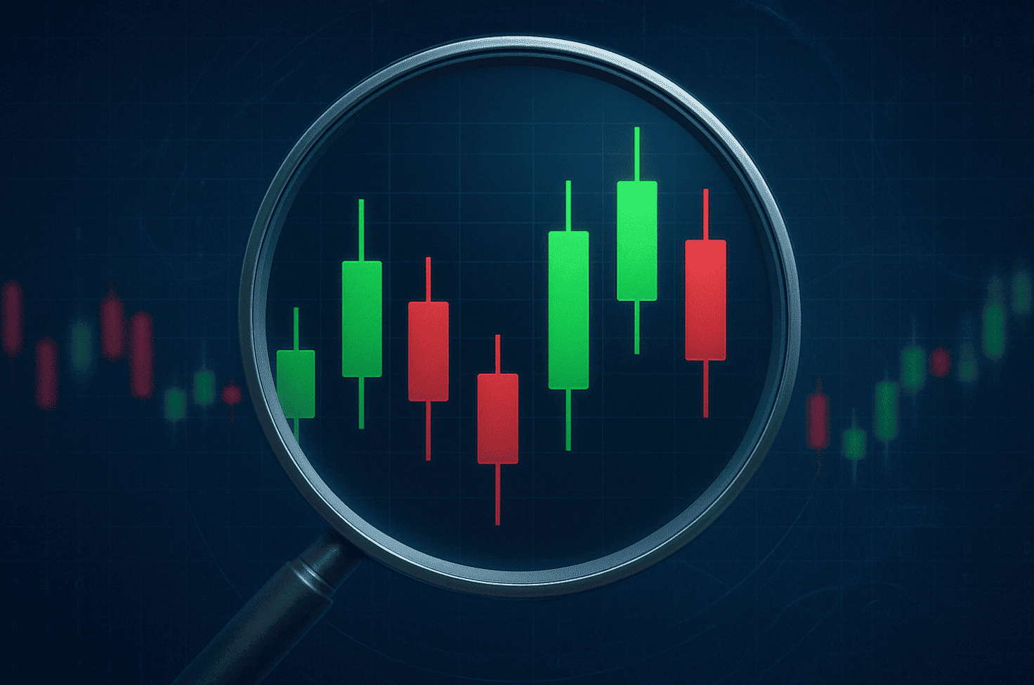
What Are Candlesticks?
Candlesticks are the most popular way to display price action in the crypto market. Each candle contains four key values for a chosen time period:
- Open price
- Close price
- Highest price
- Lowest price
A candle consists of a body and wicks. The body shows the difference between the open and close prices. The upper and lower wicks show the highest and lowest price reached during that period.
| Candle Part | Meaning |
|---|---|
| Body | Difference between open and close |
| Upper Wick | Highest price reached |
| Lower Wick | Lowest price reached |
Most charts use two colors:
- Green candle — price closed above the open.
- Red candle — price closed below the open.
For example, if :contentReference[oaicite:2]{index=2} opens at $65,000, drops to $64,700, rises to $65,800, and closes at $65,600, the candle will display that entire range. The body will usually be green because the close is higher than the open.
What Candles Can Tell You
Candles provide much more information than a simple line chart. They can help you understand:
- whether the market is confident in its move;
- whether there were sharp rejections;
- whether buyers and sellers are fighting;
- whether momentum is weakening.
For example, a long green candle often means strong buying pressure. A long upper wick may indicate buyers pushed the price higher, but sellers forced it back down. A small candle body with long wicks may show indecision in the market.
Expert Tip: Never judge one candle without context. Always look where it appears: after a rally, after a drop, near a support level, or inside a sideways range.
How to Read Trading Volume
Trading volume is the amount of an asset bought and sold during a selected time period. On most charts, volume appears at the bottom as vertical bars. It helps measure how much market participation supports a price move.
If price rises sharply while volume is high, it often means many market participants support the move. Such movement is usually stronger than a rise with weak volume.
How to Interpret Volume
- Price rises + high volume — strong buyer interest.
- Price falls + high volume — strong selling pressure.
- Price moves + low volume — weak confirmation.
- Sudden volume spike — major event or battle at a key level.
Many beginners focus only on candles and ignore volume. This is a mistake. Volume often helps confirm whether a breakout is real or false.
If price breaks above resistance with a strong green candle and volume increases significantly, the breakout looks more reliable. If volume stays weak, price may quickly fall back below the level.
What Is a Trend and How to Identify It
A trend is the overall direction of price movement. It is one of the most important parts of reading a crypto price chart. If you do not understand the trend, single candles can be misleading.
There are three main types of trend:
- Uptrend — higher highs and higher lows.
- Downtrend — lower highs and lower lows.
- Sideways trend — price moves inside a range.
| Trend Type | Signs | Meaning |
|---|---|---|
| Uptrend | Higher highs and higher lows | Buyers are stronger |
| Downtrend | Lower highs and lower lows | Sellers are stronger |
| Sideways | Range movement | Uncertainty or accumulation |
To identify trend, you do not need advanced indicators. Simply check whether price continues making higher highs or lower lows.
Main beginner rule: never analyze one candle without knowing the trend first.
Pros and Cons of Chart Analysis
Pros
- helps understand market behavior;
- reduces random decisions;
- shows trend and momentum;
- useful for traders and investors;
- improves discipline.
Cons
- does not guarantee future movement;
- beginners may misread signals;
- small timeframes contain noise;
- context always matters;
- emotions can ruin analysis.
Technical analysis is not magic. It is a tool that helps improve probability and decision-making.
How to Learn Chart Reading Properly
- Start with higher timeframes and identify the trend.
- Look at recent highs and lows.
- Study the latest candle shapes.
- Check whether volume confirms the move.
- Only then move to smaller timeframes.
This top-down method helps you understand the bigger picture before focusing on details.
Expert Tip: Spend several weeks watching charts without trading real money. This builds market understanding without unnecessary risk.
Common Beginner Mistakes
- Analyzing one candle without context.
- Ignoring the trend.
- Ignoring volume.
- Using only 1-minute charts.
- Making emotional decisions.
- Trying to predict every move.
The goal of chart reading is not to predict every price movement. It is to understand the market better and make smarter decisions.
Practical Tips for 2026
- Start analysis from 4H or daily charts.
- Watch volume during breakouts.
- Mark key support and resistance levels.
- Do not confuse pullbacks with reversals.
- Keep notes about chart behavior.
- Avoid emotional FOMO entries.
- Compare different assets to understand market mood.
Bitcoin often influences the broader crypto market. If altcoins rise while Bitcoin is weak, caution may be needed.
FAQ
Can beginners learn to read crypto charts?
Yes. Understanding candles, volume, and trend gives a strong foundation.
What is the best timeframe for beginners?
4-hour and daily charts are usually easier because they contain less noise.
Do candlesticks predict future prices?
No. They show past and current market behavior, not guaranteed future moves.
Why is volume important?
Volume helps confirm whether a move is strong or weak.
What matters more: candles or trend?
Trend matters more because it provides context for candles.
Conclusion
Reading a crypto price chart becomes much easier when you understand the three foundations: candlesticks, volume, and trend. Candles show price behavior, volume reveals strength, and trend gives overall direction.
The best way to improve is to observe charts regularly, compare timeframes, and avoid rushing into conclusions. Over time, you will understand market logic much better and make smarter decisions.